Is Neumorphism the design of the future?
 GriDD
GriDD This article was written by former GriDD member Diederik van de Heg.
At GriDD we think it is important to always be aware of developments around Customer Experience. In addition to developments in the field of strategy, User Experience and user research, Design Systems are also a part of this. A design system is a collection of visual elements such as buttons, images, links, and principles that make up digital products such as apps and websites. Such a design system ensures that your users have a consistent user experience between, for example, a phone and a laptop.
Anyone who casually browses Behance or Dribbble has probably already seen it; Neurmophism, also known as Soft UI. A UI system in which buttons, cards and other UI elements appear to extrude from background, instead of floating above it. What all started with a Dribbble shot by designer alexplyuto, quickly sparked discussions on the designer platform, and got thousands of likes. So it didn’t take long before other designers (myself included) started experimenting with this new system.
Will we see Neumorphism daily on our desktop, tablet and phone?
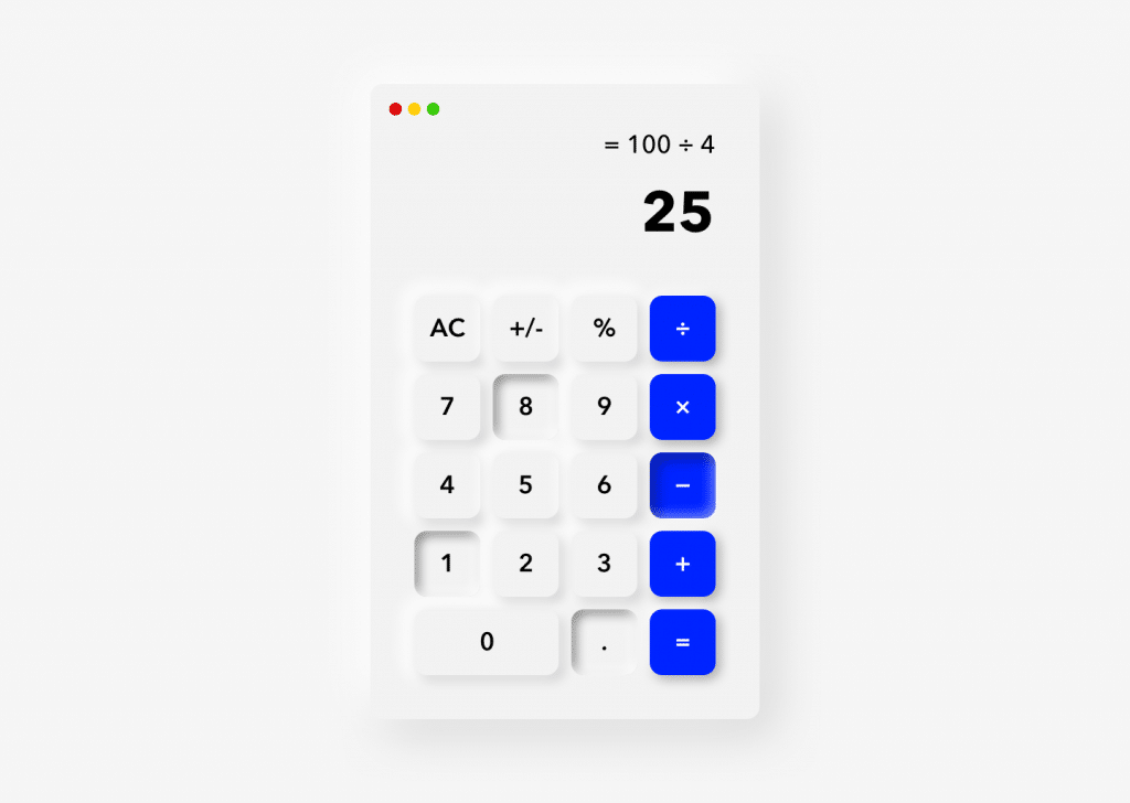
As a test I made a Neumorphic calculator in Sketch
Skeuomorphic, Flat en Material design
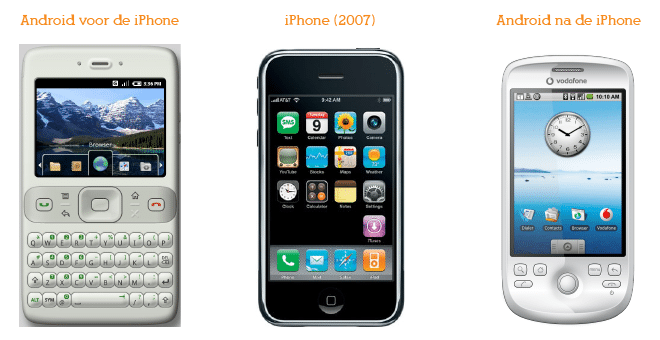
iOS 1 and Skeuomorphism
After five years users were familiar with touchscreen interfaces, and a new design system became popular; it was Flat Design. Anyone who owned a Windows Phone will undoubtedly know this in the form of Metro UI. An extremely minimal design system that was the exact opposite of Skeuomorphism. Flat Design is characterised by extremely minimal, two-dimensional, monochrome UI elements. This minimalism is one of the problems with Flat Design. Because all UI elements are two dimensional, it becomes virtually impossible to design visual indicators such as hovering over a button, a clickable button, or a draggable UI element.
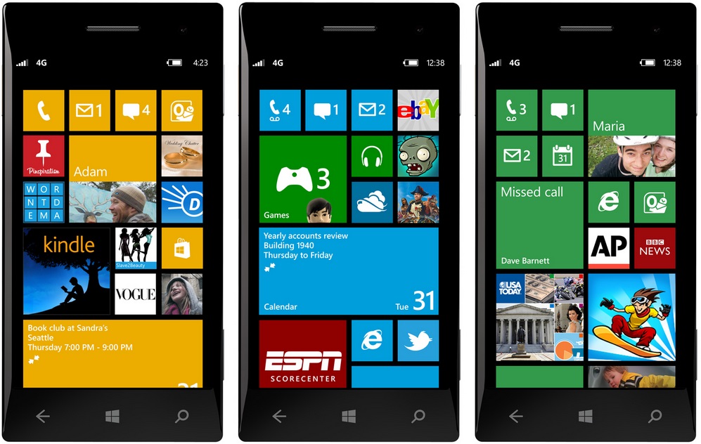
Windows Phone met Metro UI
It didn’t take long before a new, better design system took over in 2014; Material Design from Google. Material Design is characterised by a combination between Skeuomorphism and Flat Design. Where Flat Design is two dimensional, Material Design is three dimensional. It uses overlaps, shadows, and depth adding an entire dimension for interaction design. Supported by large-scale user research, and with a gigantic reference manual which is available for free, this is the design system that’s pretty much the industry standard today. The Android OS is designed entirely with Material Design.
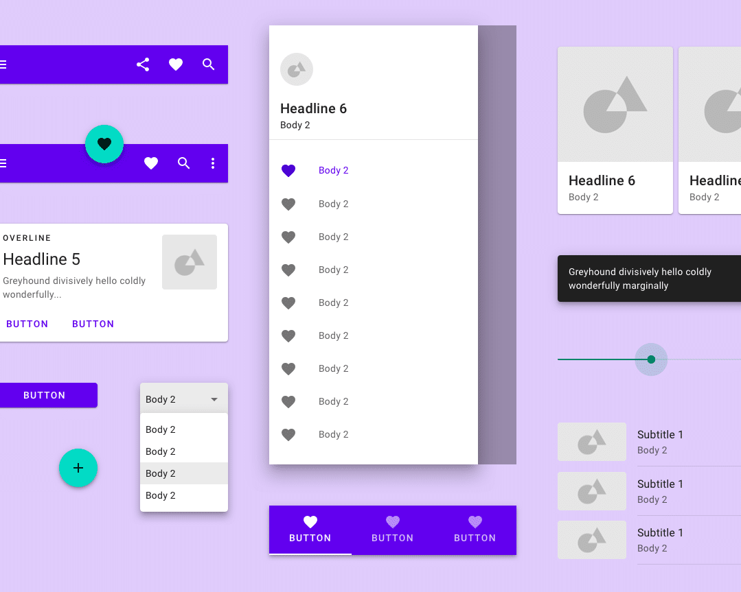
UI-element overview of Material Design
Neumorphic design seems to go back to its Skeuomorphic predecessor. Buttons that make it look like they are extruding from the screen and sliders with textures so that your finger would have more grip. However, you encounter many problems that Skeuomorphism and Flat Design also had. A monochrome button will never be as attractive as a big red button. However, this is not possible in Neumorphism, because with this design system buttons must have the same color as their background, in order to create the extruded illusion. So Neumorphism and interactive buttons don’t mix well, not to mention users with lower screen resolutions or the visually impaired!
However, I am not saying that Neumorphism is bad by definition. If applied subtly, it can give your product a unique, modern look.
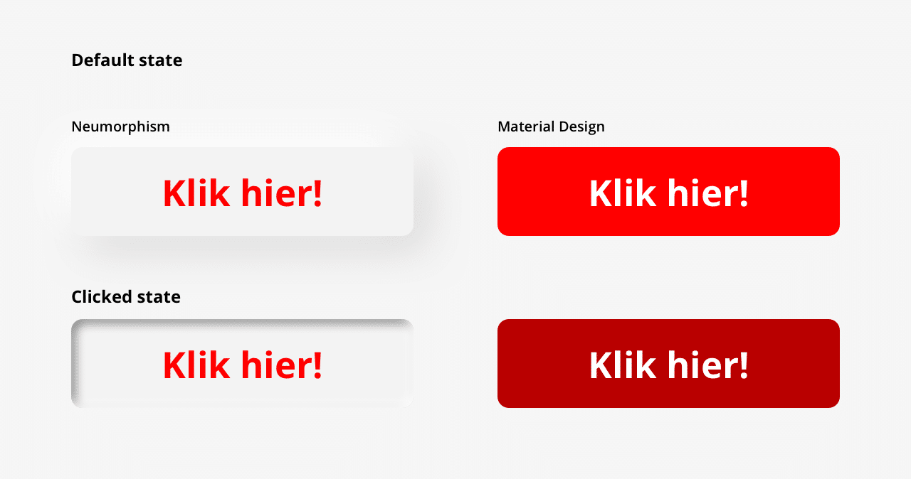
Which button looks the most clickable?
What do your users want?
So, should you jump the gun and embrace Neumorphism? No, probably not. Don’t get me wrong, I love new trends in UI and UX design, as long as this provides added value for your users.
Imagine you’re developing a mobile app for the elderly. Do they benefit from a new, hyper modern Design System? Perhaps this group is more in need of realistic icons to make it easier to find their way in the application.
Ask your users
The most important thing is that you ask your users. Do they even need a redesign? Aren’t there any other problems they find much more urgent? The only way to find out is to start a dialogue with your users. And I’m not talking about gigantic surveys, eye-tracking, and complete psychoanalyses, but about accessible conversations with your users. (Don’t know how? We are happy to help you through our UX lab!) With such conversations you can really find out what your users want.
Did you discover that your users think the design of your UI is outdated and due for a redesign? Great, then you could set up a quick test with, for example, Neumorphism to test whether this style appeals to your users. Don’t your users like it? Then I am sure you have gathered new, valuable information about your users!
Will we be seeing Neumorphism in 2020?
When I look at the challenges surrounding the usability with Neumorphism, I wonder if we’ll see it a lot in 2020. It is a design system with quite a few snags, and requires a sharp eye to ensure usability. It can definitely add value to your product, as long as you verify this with your users. After all, they are the ones actually using your product! As with other design styles, it remains a matter of taste. Your users may not like Neumorphism at all, and they would much rather see a new functionality added to your product.
So to answer the question, is Neumorphism the design of the future? If applied properly, it could, but ask your users, and you’ll retrieve valuable information anyway!

Want to know more about design systems, or about user testing?
Mark is ready to answer all your questions.